cybersecurity company visual rebrand.
Discovery and shapening of a visual language and brand identity in preparation for a holistic redesign of the b2b-focused cybersecurity enterprise.
the lowdown
-
Brand design + brand strategy + visual design
As the primary designer on the marketing team, my responsibilities consisted of discovering and shaping the company’s visual language and brand identity. The purpose was to convey long-term brand values while incorporating stakeholders’ requests to tie in the brand’s refreshed sense of direction and personality.
-
The company’s current approach to brand styles and inclusivity are outdated: the website carries years of technical debt; current brand styles are not ADA compliant; the website as a whole is wearying to navigate; calls to action throughout the site feel enigmatic; and, last but not least, current brand styles do not conform to the previously branding guidelines as they lacked a holistic approach, thus creating disconnects and disparities between digital and analog properties.
-
If I can get the C-suite on board with an updated look, feel, and overall approach and intent for the brand identity when we redesign the company website then our users and our broader cybersecurity audience will see that there are bigger changes happening at and within the enterprise. These updates enable us to communicate that we are making positive and major changes behind the scenes that will ultimately affect our users, processes, and unified brand experience positively.
-
CEO: being inclusive of people who aren’t considered our “typical” user; is it aesthetically pleasing?
CMO: being approachable and not being too unconventional (and pushing away our users); being palatable to a large and technical user base.
VP: looking sleek; feeling like b2b without overusing enterprise tropes or being too conventional; wanting to be modern, unconventional; how will we choose to present ourselves against our competitors?
Director: does it make sense for our users; is it aesthetically pleasing; how does this compare relative to our competitors?
Designer: does it make sense for our users; is it accessible; is it aesthetically pleasing; how does this compare relative to our competitors?
the discovery
Who are the users and how does that inform how I’ll approach the designs?
With over 70% of the user base being male, which folks will I choose to be inclusive towards and ultimately choose to represent through the imagery choices being made on the rebranded company site?
Knowing that over 80% of users are on desktop helps me understand that the desktop experience is what will be prioritized over other device types as the team considers the minimum viable product for the near future.
How are we relating to the 80% of users who are new to this brand? How can I appropriately represent and introduce the brand as a 2 decades plus leader in the cybersecurity industry?
What choices will we make to relate to the 55% of users who are younger than the age of 45 and may have different expectations from a website than the average user?
the process
Ideate
Brainstorming came with ideating what the major themes would be for each mood board that would convey a specific tone and vision for the brand. This means cherry-picking adjectives that our customers and C-suite would agree represent the company’s brand, then articulating these values within my designs.

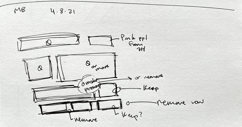
Before digitizing any designs, I typically sketch out the concepts to help myself organize and document my thinking around the concept, and consider how best to execute the idea.
Evaluate
Conversations around mood board evaluations happened internally with the project owner (director) and consultant designer to further realize the tone and personality based on the themes presented in each board. This typically involves relatively minor changes to each board concept, making sure that the theme and visual elements are as aligned as possible before approaching the C-suite (project’s primary stakeholders) for critique.
After taking the time to evaluate images chosen for an iteration of a mood board, the internal team had feedback on which images were working best for the themes selected.
Critique
Sessions began with presentations to the C-suite in order to spark rounds of deliberation to be had about the mood board. Feedback on the presented designs was requested within a weeks’ time.
Repeat
If updates to the designs were required, then the process of ideation sessions, internal evaluation, and stakeholder critique was repeated to a point that the requested updates were different enough from the presented mood boards.
the outcomes of this iterative process

Second iteration: use of a more mature, conventional color palette; Noto Sans for type; white icons used on dark backgrounds; organic, ethereal imagery; themes include adjectives “confident, well-informed, experienced.”

Fourth iteration: use of a more versatile color palette; Roboto for type; colorful icon backgrounds; more lucid, architectural, people-focused imagery; themes include adjectives “vibrant, connected, dynamic.”

Final iteration: use of a vibrant color palette; Roboto for type; bold icons on a deep background; conventional cybersecurity tied in with pronounced, architectural close-ups, and people-focused imagery; themes include adjectives “vibrant, dynamic, connected, evolving.”
final decisions + tradeoffs
In the final analysis, here are some of the major decision points that benefitted the team and made the project what it has finally amounted to today
Our team initially had plans to use all original imagery as opposed to using more generic, conventional cybersecurity imagery in order to stand out from our competitors, but Covid put this plan on pause. In the meantime, without the photoshoots at the company headquarters, the team saves resources and has a chance to better prepare once the team is ready to execute on the photo- and videography creative process.
Roboto felt like a choice that the Director and VP of Marketing had been waiting to make which may have not given Noto Sans a fair chance from the beginning. Though, ultimately, Roboto is clean, direct, great for readability, as well as site load times.
The final iteration of the mood board came down to being a vibrant, bold, and versatile color palette - containing a pool of colors that we can continue to choose from in order to remain dynamic through specific campaigns, several products, and a variety of events that the enterprise will continue to host in the future. This vibrancy also allows us to stay connected with the younger user base in the ever-evolving cybersecurity industry.
learnings
Not only was this a first-time branding project for me, but also the first time I got to work directly with executives and senior management of a company to determine the look, feel, and overall approach to the brand identity. This helped me learn to gauge speaking to and approaching specific stakeholders who ultimately have a major impact on the final design, which is heavily based on the design’s first impression and presentation.
In retrospect, at the beginning of the project, I had a narrow perspective of what professionalism and modernism in the enterprise space can look and feel like. I wish I had taken the opportunity to branch out and test the waters sooner with some of the bolder, more out of the box approaches to colors, imagery, and themes.