verizon design systems chat expansion pack.
A new component library spinoff of an already existing design system within Verizon (Monarch or VDS) to focus on chat and AI assistants (CXP).
the lowdown
-
Senior Design Systems Designer
-
The existing Verizon Design System proved to lack the flexibility and functionality that was needed from the ever-evolving chatbot and AI assistant.
-
If the Verizon Design System proved to have the flexibility and functionality that’s needed from the ever-evolving chatbot and AI assistant then users would be able to attain higher levels of success in their Jobs-To-Be-Done because the components offer them accessible and delightful designs that sincerely understand and assist them in achieving their goals.
discovery
The existing team designers had already audited the existing Verizon Design System (VDS)
Organized and facilitated deep dive discussions with design and engineering partners to establish scope, requirements, and definitions
designing
Immediate deep dive into creating components needed from the VDS component audit for chat interaction and matching to Monarch stylistic and accessibility standards
There was a 2-day-turnaround for component creation to completed design spec based on tight timelines and deadlines
iterating
Daily standups and async feedback sessions enabled quick turnarounds on initial iteration, all the way tothe final polished state
Agile feedback and working sessions between design + development progress
the components
1. AI Disclosure
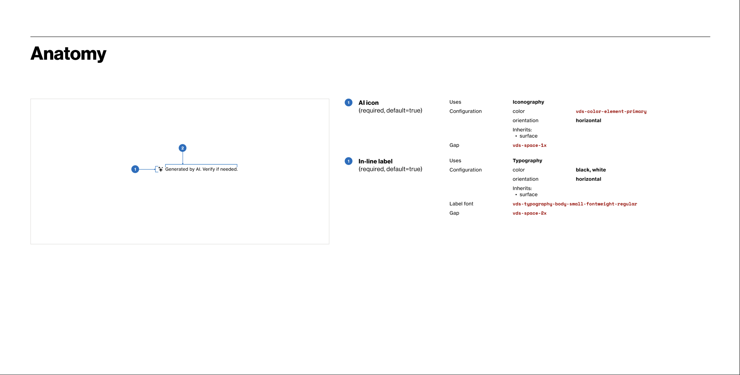
AI Disclosure component specs

AI Disclosure component configurations for primary surface-type only
2. Feedback
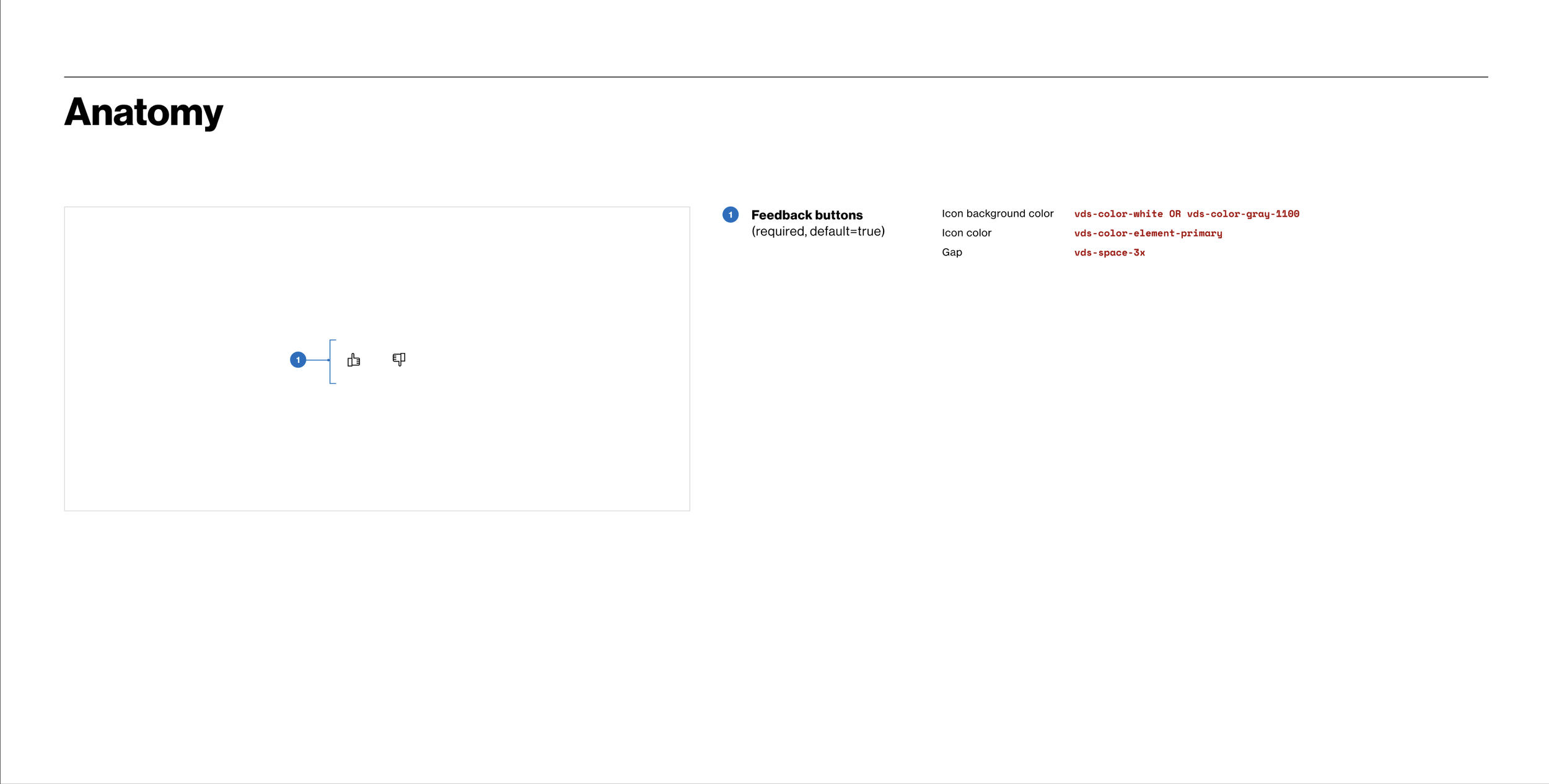
Feedback component specs
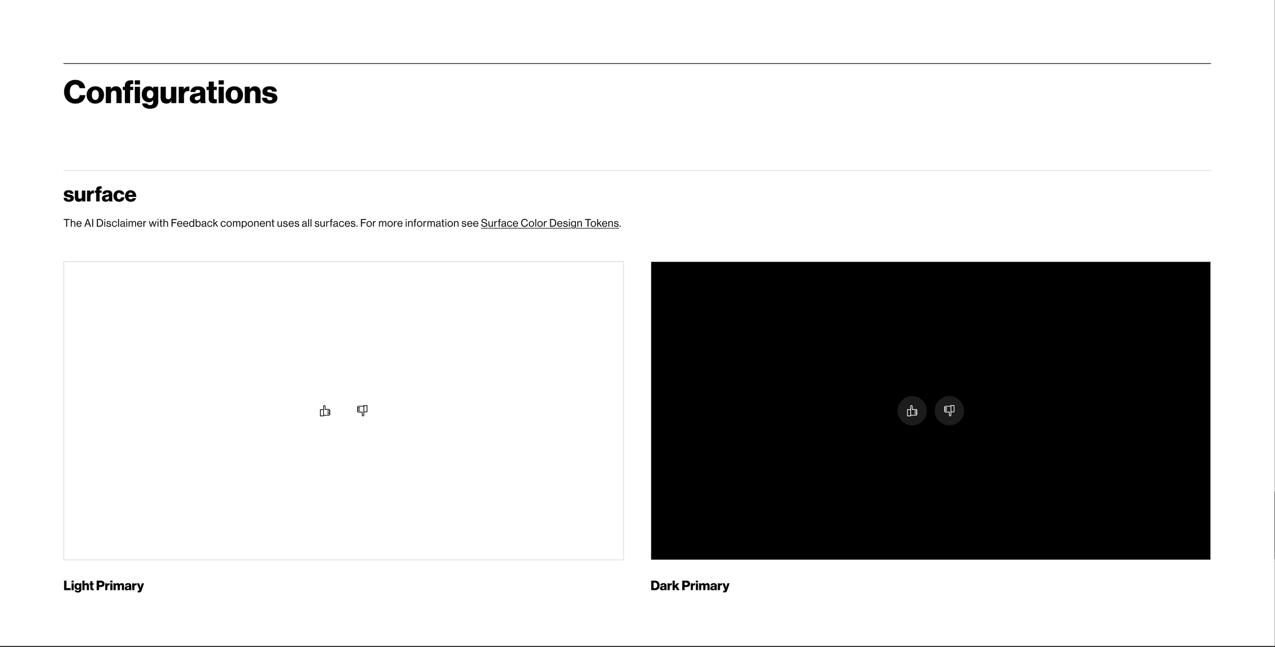
Feedback component configurations for primary surface-type only
3. List
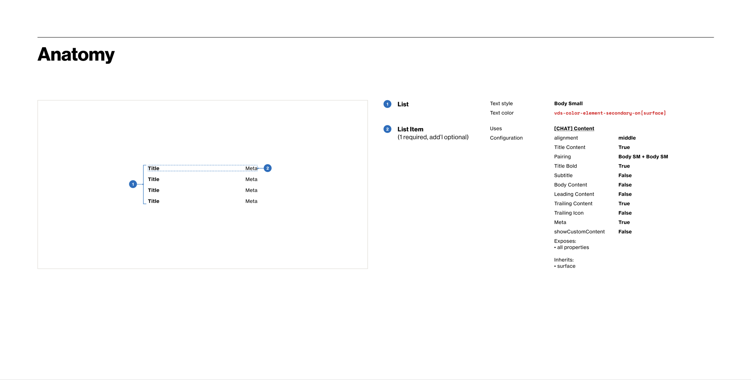
List component specs
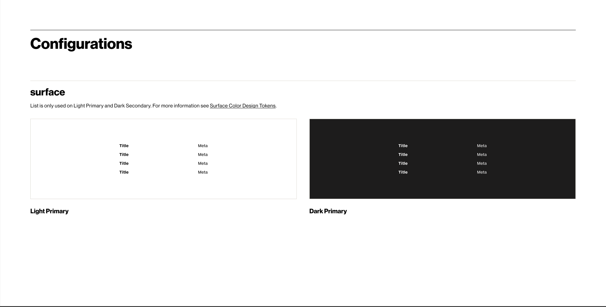
List component configurations for primary surface-type only
4. modifier
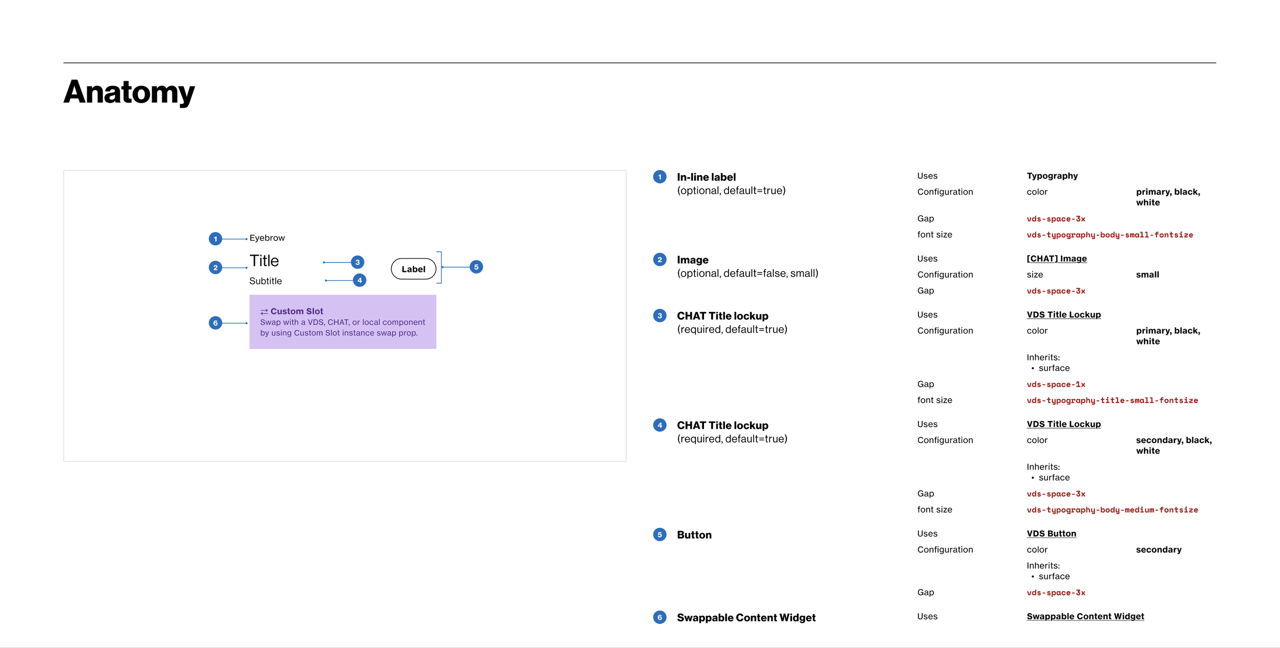
Modifier component specs
Modifier component configurations for all surface types
5. Radio box
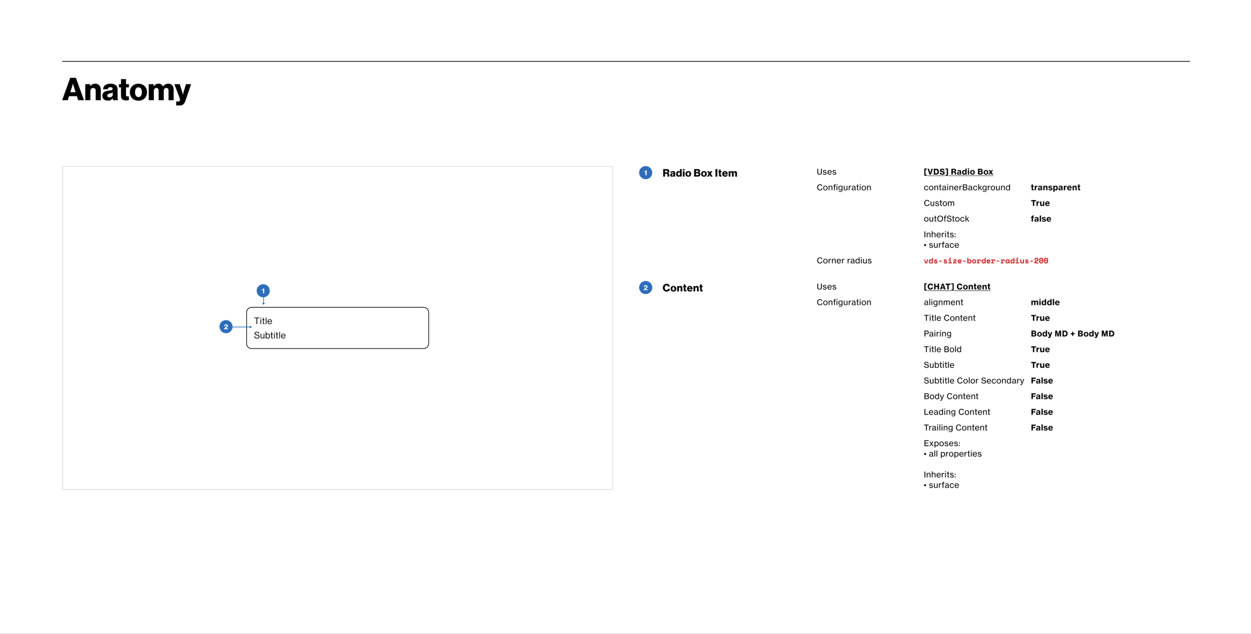
Radio Box component specs
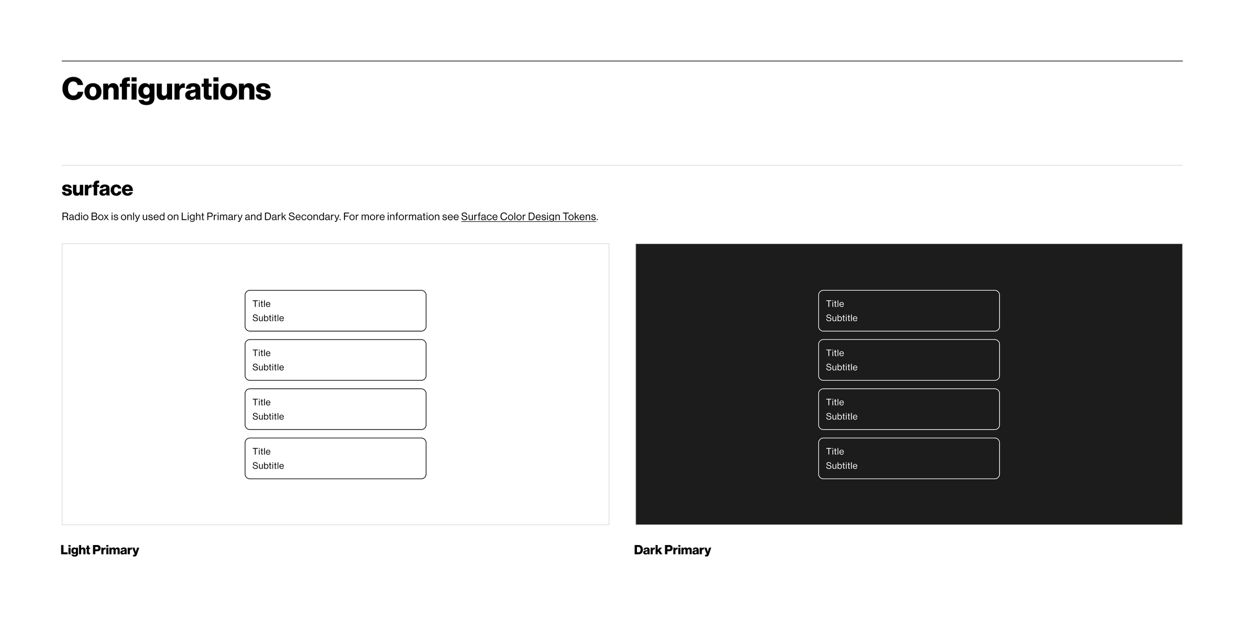
Radio Box component configurations for primary surface-type only
6. tag group
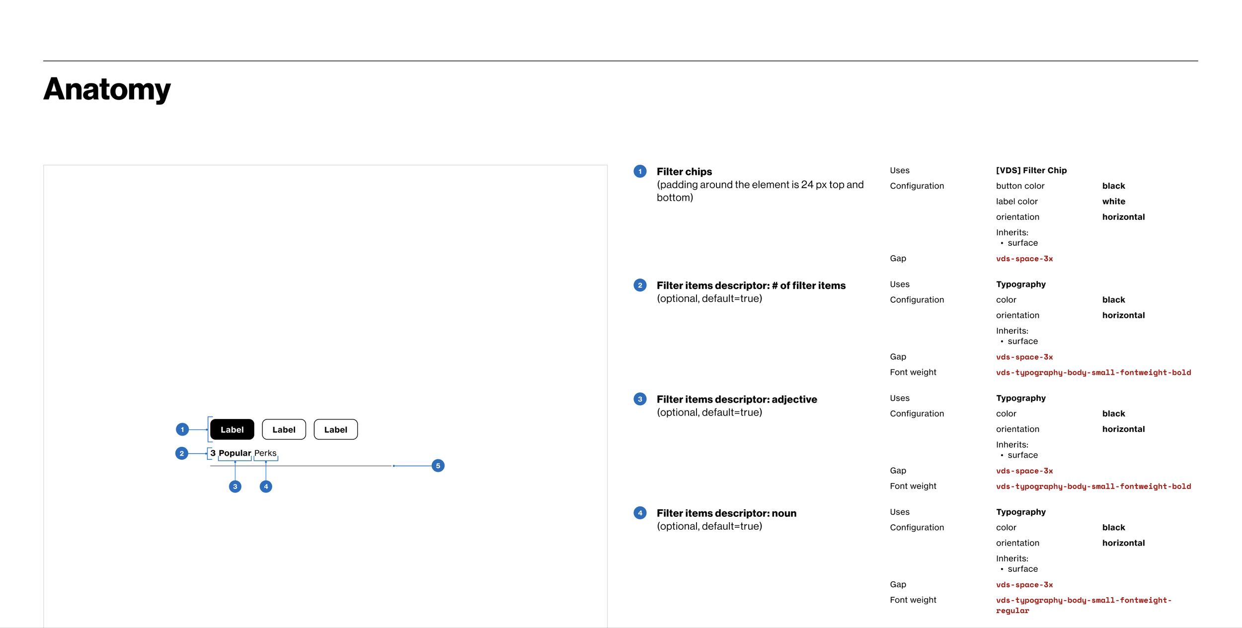
Tag Group component specs
Tag Group component configurations for primary surface-type only
final decisions + tradeoffs
Ultimately, the pivotal decision points that benefited the outcome of the components are listed below
Accessibility and scalability as my personal favorite design principles
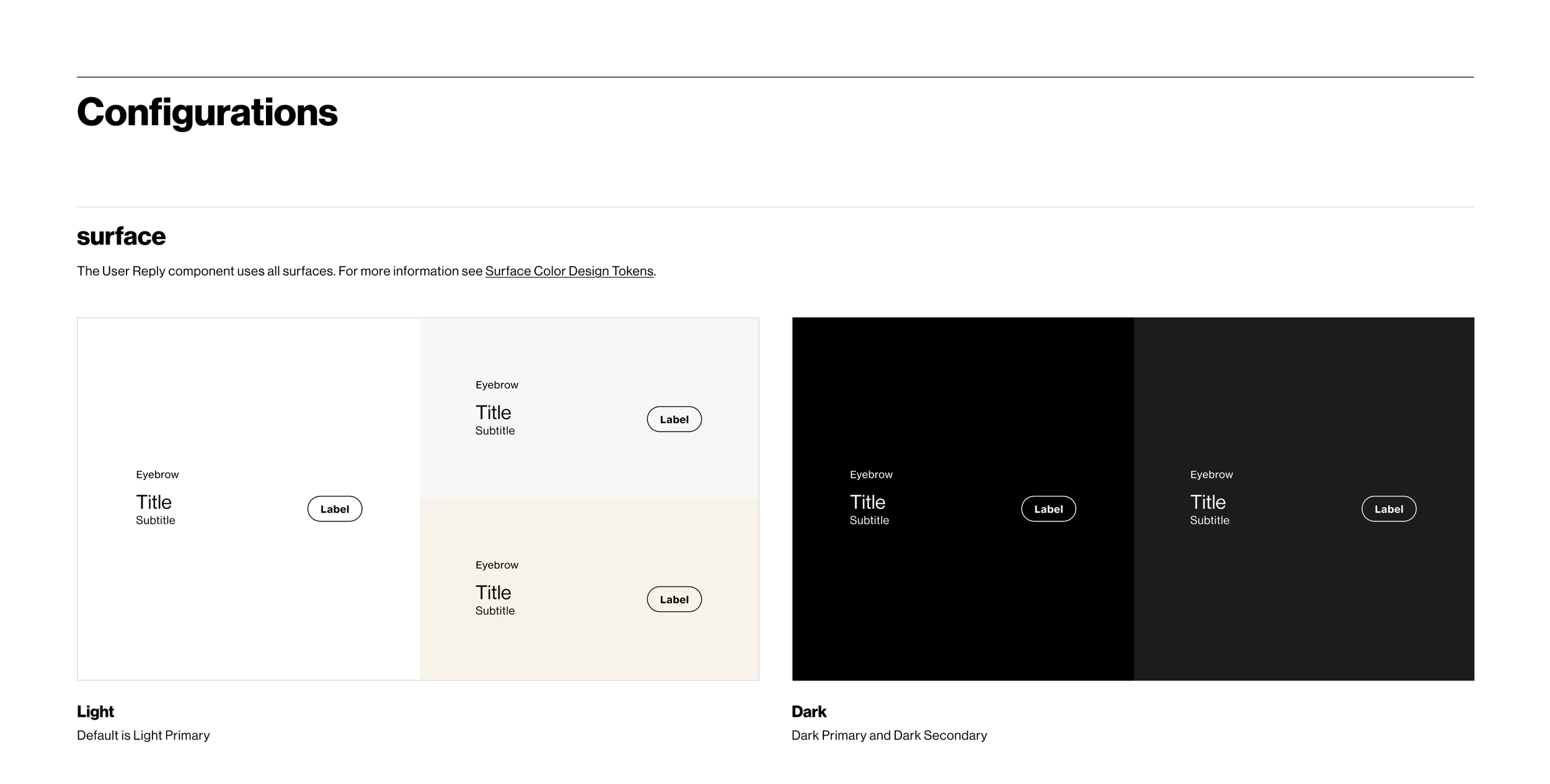
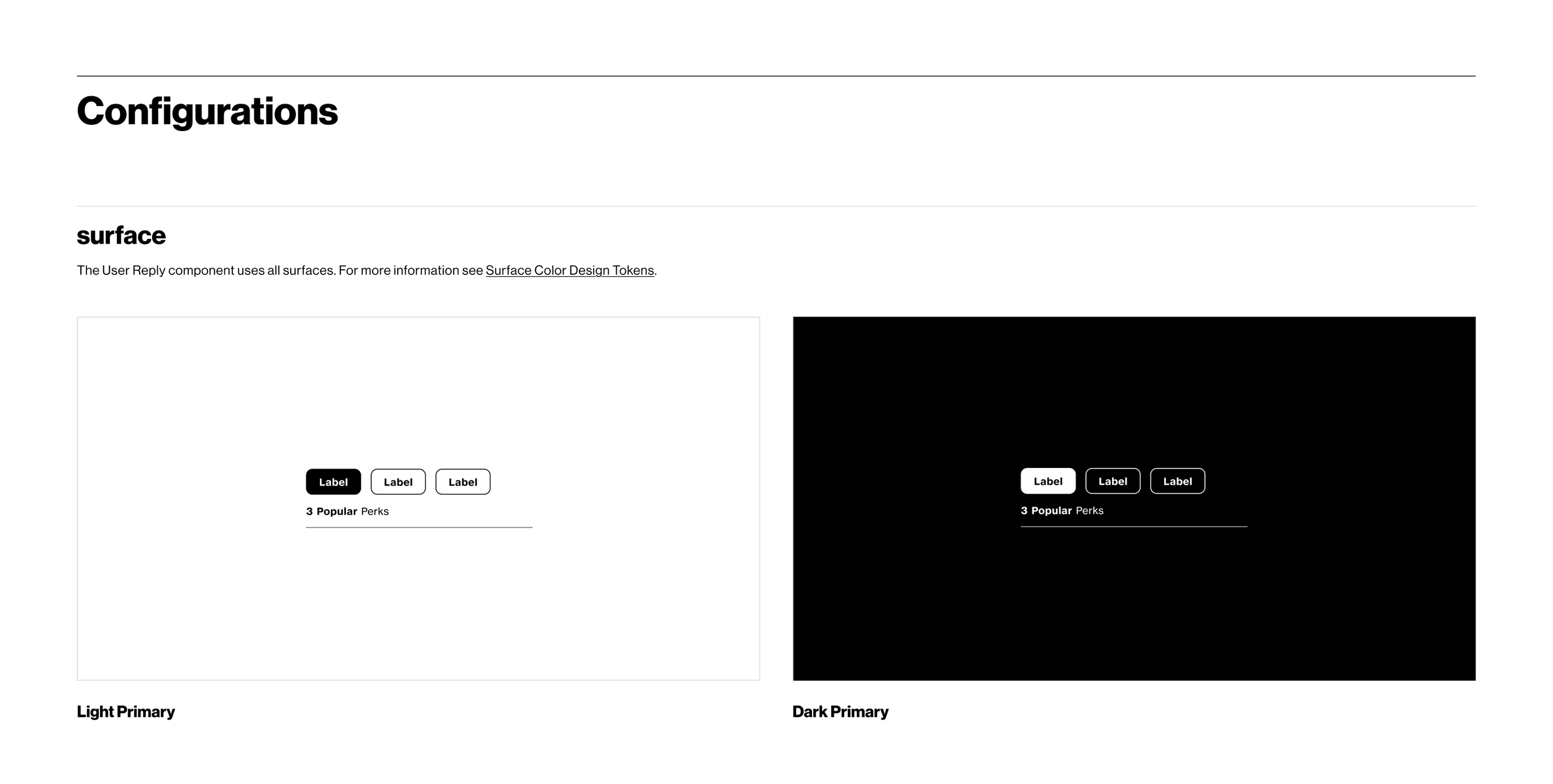
User Reply component became a part of Message Group for the purposes of
Consistency and cohesion within the chat experience
For the convenience and ease of use for designers utilizing the component within their designs
learnings
Learning to weigh the difference between consistency between components vs ease of use for designers utilizing the components
The importance of alignment and cohesion taking precedence within designs. Not only with teammates, but also within designs.