microsoft fluent 2 dashboard card.
Redefining and repurposing an existing component with net new capabilities to be used on secondary dashboards within the Microsoft Admin Center.
the lowdown
-
UX design + UI design + interaction design
-
The existing Fluent 2 card component in the design system proved to lack the flexibility and functionality that was needed from the ever-evolving Fluent design system. From an aesthetic perspective, the component was also missing what was needed from the new look and feel of Microsoft (post-Copilot).
-
If the Fluent 2 card component in the design system proved to have the aesthetic, flexibility, and functionality that’s needed from the ever-evolving Fluent design system then users would be able to attain higher levels of success in their Jobs-To-Be-Done because the component offers them accessible and delightful designs that sincerely understands and assists them in achieving their goals.
the definition + scope setting
Discuss with designers what is needed from the new iteration of the component, both for the end-user, but also functionally, as a component of the design system
Bring this new project to PMs and establish timeline of project, resources needed, and basic requirements that will show the component to be complete
the working sessions
Discussions with other designers in the Microsoft Admin Center and Fluent design systems spaces to analyze flexibility and scalability of the Fluent 2 card
Voting and decision-making backed by research done before the component went back into an iterative design process (e.g.: deciding on how many lines of text exist with or without a progress bar; purpose of primary vs secondary CTAs; maximum character counts for each text element; etc.)
Feedback sessions consisted of constructive conversations around form and function of each visual and interactive element on the Fluent 2 card
the design
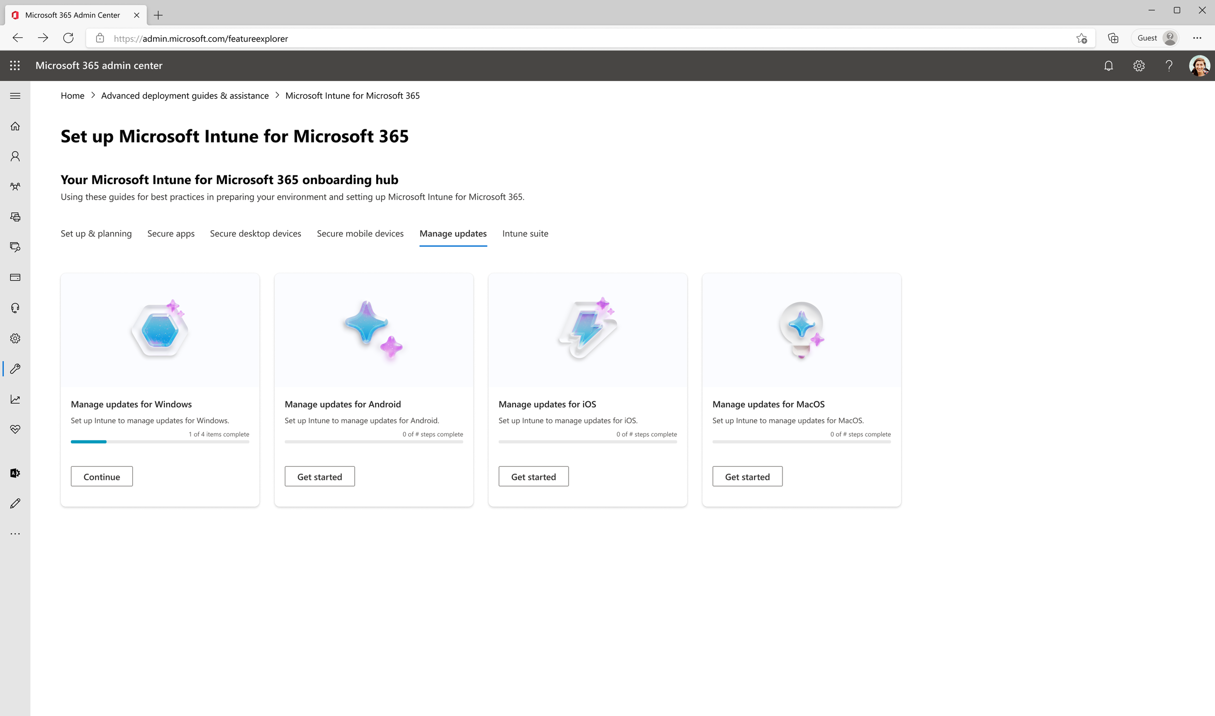
light theme
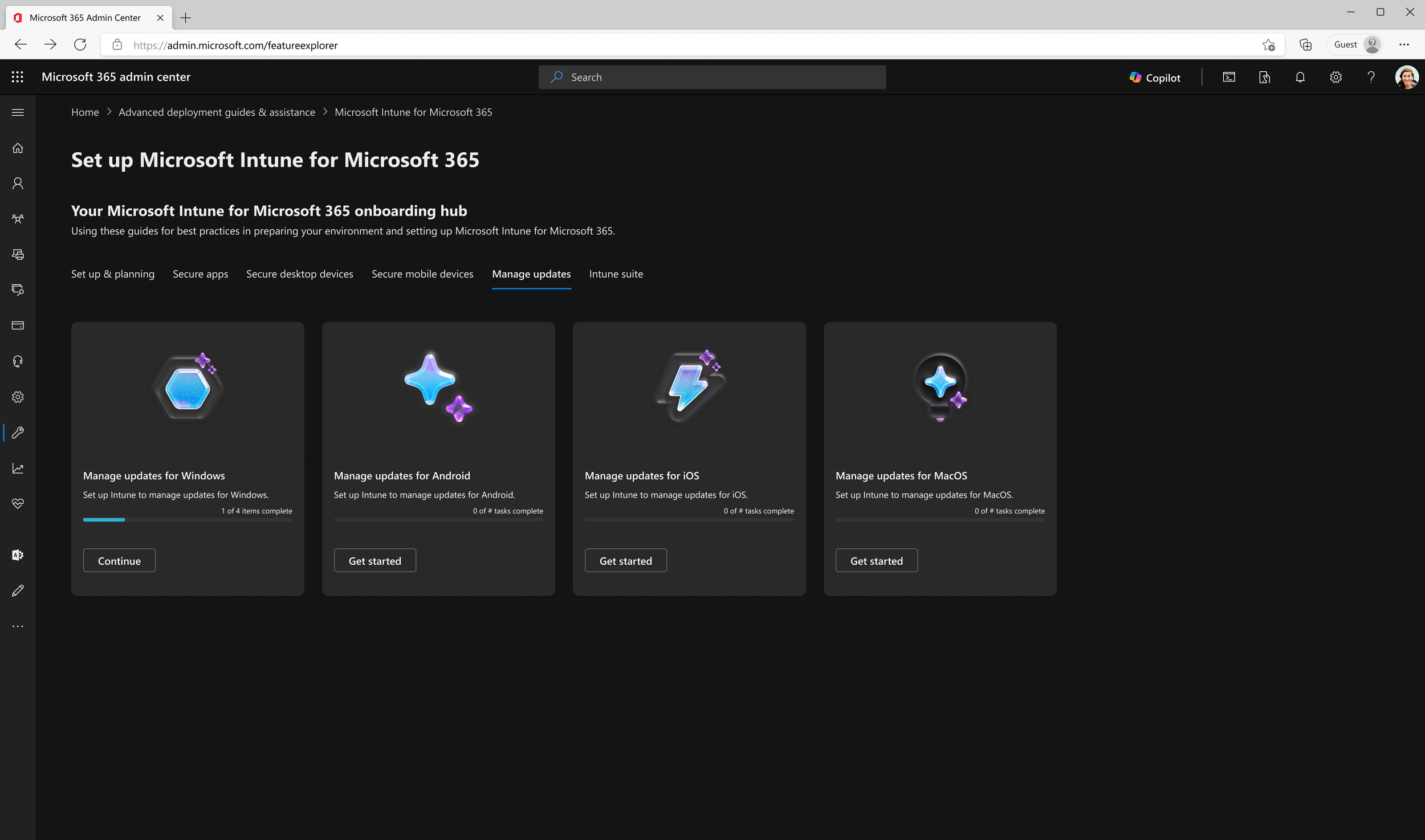
dark theme
the progress states

Fluent 2 updated card component for Microsoft Intune (secondary) Dashboard showing “not started” state.

Fluent 2 updated card component for Microsoft Intune (secondary) Dashboard showing “in progress” state.

Fluent 2 updated card component for Microsoft Intune (secondary) Dashboard showing “completed” state.
final decisions + tradeoffs
Ultimately, the pivotal decision points that benefited the outcome of the component are listed below
Progress bar vs no progress bar
As a result of no progress bar, 4 lines of descriptor text
learnings
Component function and scalability as high-priority design system principles
Clarity, precision, and organization as means of communication
Deliberately taking charge and deciding to take a lead designer role for the project instead of being afraid of stepping on toes